
Most post-purchase confirmation pages are an afterthought — the checkout flow gets careful attention, and then the “thank you” screen is whatever the payment provider or framework defaults to. That’s a missed moment. Someone just gave you money; it’s the one point in the entire funnel where their attention and goodwill are both at their highest, and a generic confirmation screen wastes it.
This is about why that page deserves its own attention, and why it often works better living outside your main application entirely.
Why the default confirmation screen falls short
Most apps handle “purchase complete” as a route inside the same authenticated app shell as everything else — same navigation, same layout, same visual weight as an account settings page. That’s technically fine, but it treats a genuinely different moment (someone just committed money) identically to a routine one (someone’s checking their billing history).
There’s also a practical problem: if anything in your app has a hiccup right after checkout — a slow database write, a webhook that hasn’t fired yet — the confirmation page can end up broken or stuck loading at the exact moment you most need it to feel solid and trustworthy.
What this page should actually do
- Confirm the purchase clearly. What they bought, and that it went through — stated plainly, not implied.
- Tell them what happens next. An email confirmation, access instructions, a setup step — whatever the very next action is.
- Reduce anxiety, not just relay information. People genuinely worry “did that actually work” for a few seconds after paying — a page that projects calm confidence matters more here than almost anywhere else in the funnel.
- Optionally, open a next step. A link to a Discord community, a getting-started guide, or a calendar link for onboarding, if relevant.
Why decoupling it from your app helps
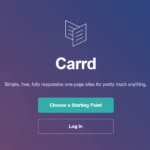
A confirmation page that’s independent of your app’s runtime state loads reliably even if something in your backend is momentarily behind — it doesn’t need to query your database to say “thank you, check your email for next steps.” Carrd works well for this specific job: a static, fast, always-available page that confirms the moment and points to what’s next, without depending on the exact system that might be under the most load right after a purchase.
Getting the tone right
Warmth over efficiency
This is one of the few pages where being purely functional undersells the moment. “Payment received” is accurate but cold. “You’re in — check your inbox in the next few minutes” does the same job with actual warmth, and costs nothing extra to write.
Set a realistic timeline for next steps
If access isn’t instant, say so. “Your account will be ready within 10 minutes” prevents someone from refreshing anxiously and assuming something broke, which is a genuinely common (and avoidable) source of support tickets.
Don’t ask for anything else here
This isn’t the moment for an upsell, a survey, or a “please leave a review” ask. Let the purchase feel complete before asking for more — those requests land far better in a follow-up email a few days later, once they’ve actually used what they bought.
Handling the edge cases gracefully
Not every purchase completes cleanly — a payment can be pending, a webhook can be delayed, a subscription can require an extra verification step. Deciding in advance what the page says in each of those cases (rather than only designing for the happy path) prevents a confusing blank state right when someone’s most anxious about whether their payment worked. Even a generic “we’re finishing up, this can take a minute” fallback is better than a page that looks broken.
What to avoid
Avoid burying the confirmation under marketing content — a wall of “here’s everything else we offer” undercuts the simple reassurance the page is there to provide. And avoid a page that only says “thank you” with nothing actionable — leaving someone with no next step right after paying is a small but real source of buyer’s remorse.
Quick checklist
- State clearly what was purchased and that it succeeded.
- Tell them exactly what happens next, with a realistic timeframe.
- Write it warmly — this isn’t the page for purely functional copy.
- Skip upsells and surveys here; save those for a later email.
- Keep it independent of your app’s runtime, so it loads reliably even under load.
The confirmation page is a small piece of the funnel that gets a disproportionate amount of trust-building done, if you actually build it on purpose instead of accepting the default.
 Tested firsthand